MADE 4 Time
MADE is a non-profit generating money for cancer research with 2 distinct arms: We Will, and 444. I worked with the client to develop the parent organization logo as well as the separate individual logos. I also built their website but, even as the organization is actively carrying out its mission, they have not yet been ready to launch the site. When it does go live, you may see it at https://made4time.org/


Sam LaGrassa's Logo Simplification
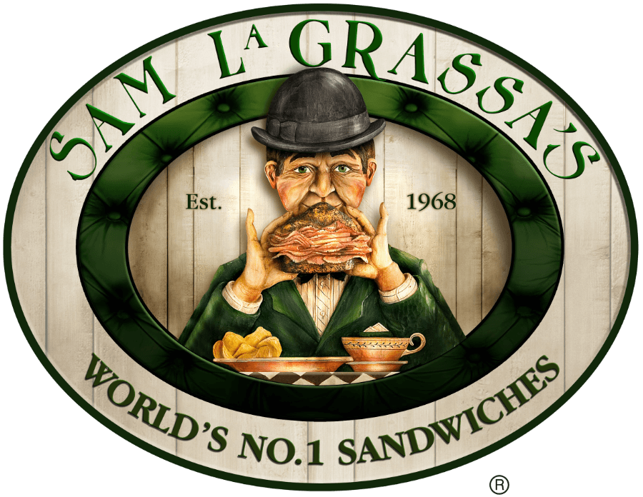
Sam LaGrassa's is a popular sandwich shop in Boston's North End, with a well-established brand. But their famous logo is not terribly versatile. A complex illustration, that they've only ever had in a raster image format, they needed a simplified vector version for situations where they may want to print in monochrome, or embroider on clothing. A lot of careful choices needed to be made, but I worked closely with the client about the level of detail we'd retain and what features to emphasize. We both wound up happy with this recreation.

I also designed and actively maintain their website at https://samlagrassas.com/ but don't have quite so much to say about it to deserve a full case-study style portfolio post about it. It's a decent site, and the client is very happy with it.
Northline Coffee Roasters
Before working full-time as a designer, I found success as a coffee roaster, where my roasts routinely scored over 90 points with the celebrated Kenneth Davids at Coffee Review. Needless to say, I still have a soft spot for coffee and, even more so now as a professional designer, for coffee packaging. This project was a personal, vanity exercise. The company and coffee are made up, but the packaging style and clean legibility of the labeling is on point with the kind of styling I’d bring to my own brand if I were ever (I won’t be) to get back into the industry.


Dolphin Insulation Mailer
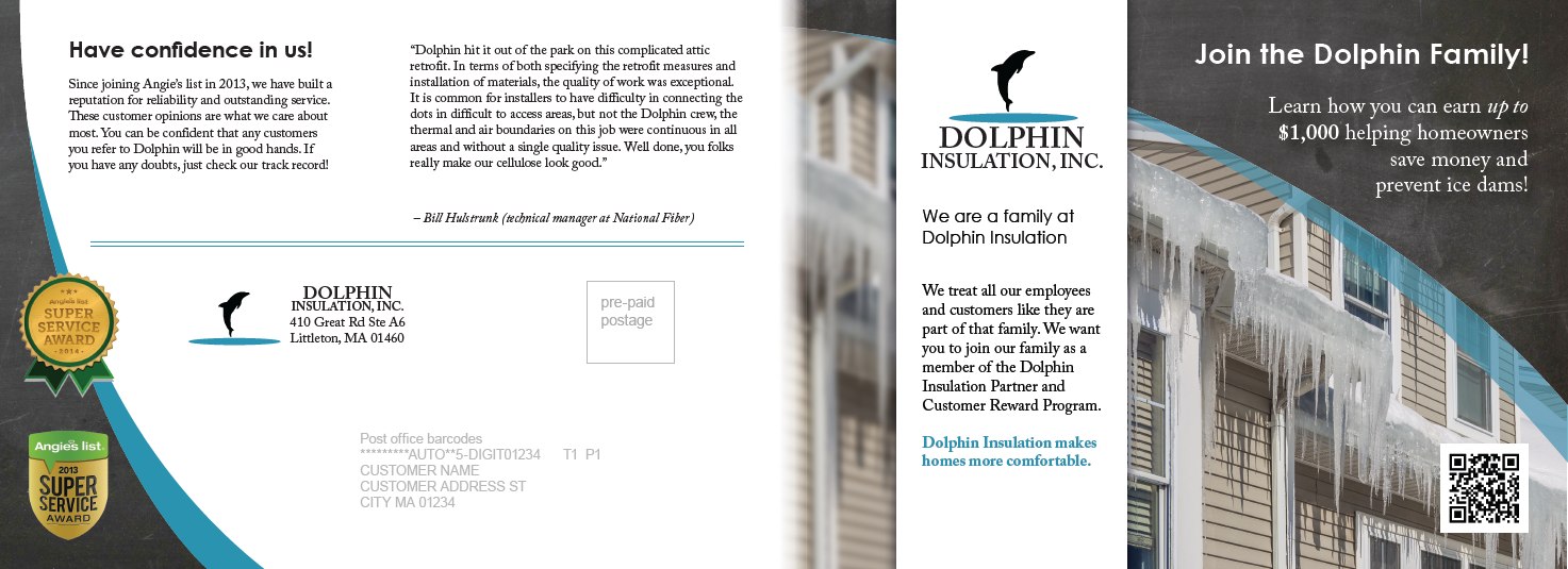
One of my older pieces in this portfolio, the project here was quite straightforward; the client knew what they wanted to communicate and the format of the mailer they wanted to send – I just needed to get the information all laid out handsomely. The illustration and photos were sourced from stock photo sites.
ACAF Product Comparison
A utilitarian and not especially beautiful example of video editing, but one that the client highly values and which they espouse as an effective demonstration that distinguishes their product from its competition.
The project required a lot of motion tracking (original footage was from drones that didn't remain perfectly stationary) and precise timing matchups of multiple counters and stats.
Health Equity Solutions Banner video
I did build their whole website, but I don't want to highlight it, per se. It satisfied all of the customer's requirements and they were happy with the result, but it's not my idea of a beautiful site. Still, you can review it here if you like: https://hesct.org/
What I find a bit more worth sharing is the simple banner video I created for them from free video assets at Pixabay. The client hadn't thought they wanted to use a background banner video until they saw one. And through careful selection of clips and well-timed transitions, I got approval to use the first draft I shared with them. It is simple and elegant, but makes a big first impression for the homepage.