Project Summary
Green Insulation Group supplies reclaimed, recycled, and factory-surplus rigid foam insulation for building and construction projects throughout North America. By returning usable insulation materials to service rather than sending them to landfills, the company offers builders and property owners a combination of significant cost savings, reliable thermal performance, and reduced environmental impact. The company has diverted more than 850,000 cubic yards of insulation from landfills while offering materials at savings typically ranging from 40–70% compared with new products.
My Role
I led the visual redesign and WordPress development of the new website, working alongside my team as we reorganized and strengthened the site's content with organic search visibility and usability in mind. I also created a new logo and expanded visual identity for the company, then carried that identity throughout the website through typography, color, illustration, imagery, and motion.
Design & Development Highlights
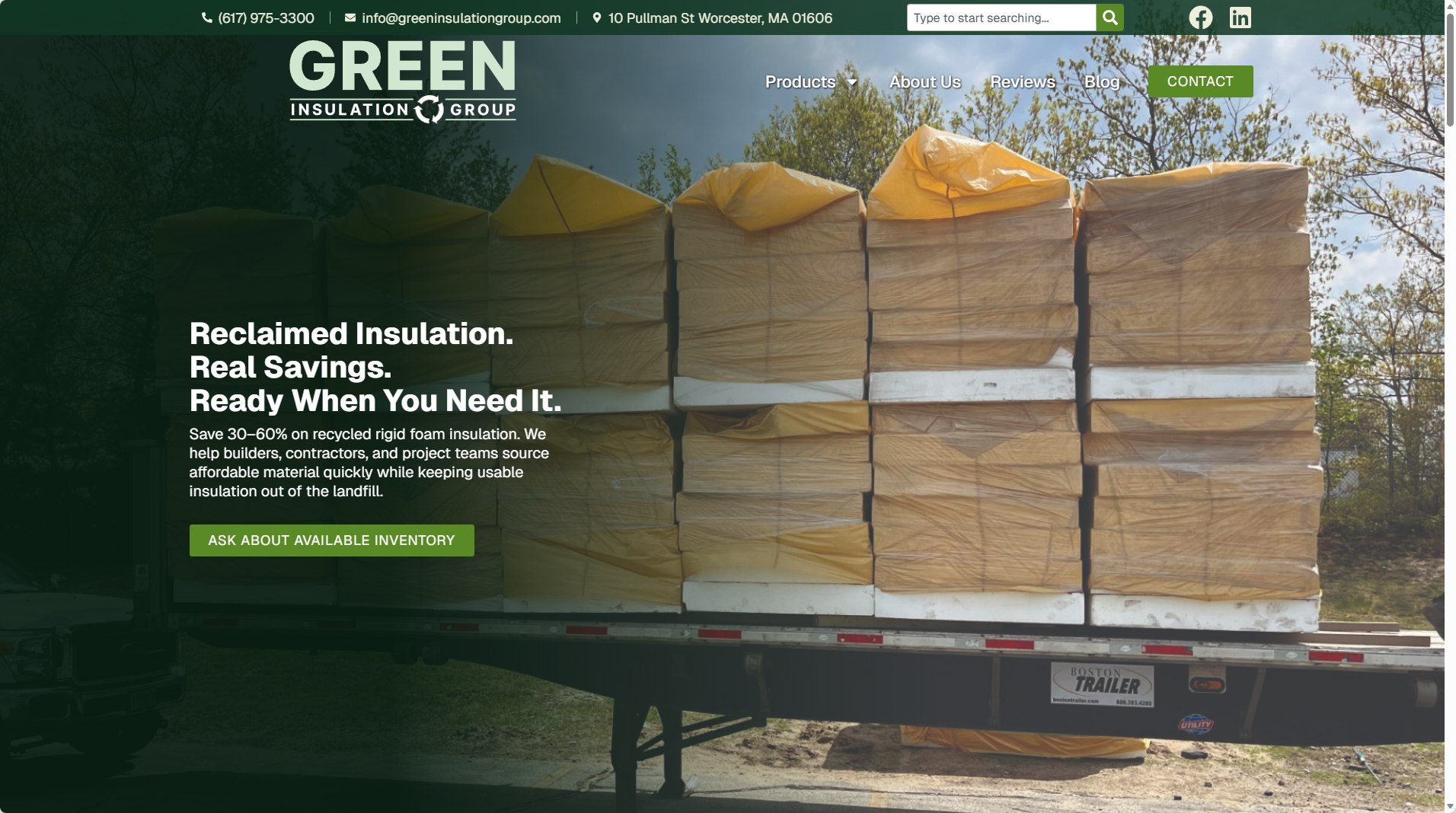
The existing Green Insulation Group site contained a surprising amount of valuable information, particularly within its extensive collection of educational articles, but the primary marketing pages did not communicate the company's strongest advantages with the same effectiveness. The redesign therefore focused not only on giving the site a more contemporary appearance, but on bringing its most persuasive messages to the forefront: substantial cost savings, environmental responsibility, product availability, nationwide delivery, and the practical performance of reclaimed insulation.
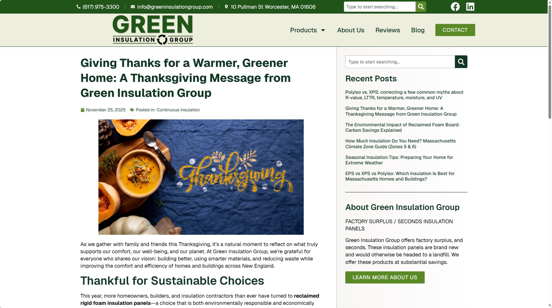
Working with my team, we reorganized and expanded key content to create clearer pathways for both users and search engines. Not every proposed content recommendation was ultimately adopted, so the design needed to make the strongest possible use of the material available. The new homepage establishes a much clearer hierarchy, moving visitors from the company's central value proposition into product categories, purchasing process, customer testimonials, company capabilities, and the site's substantial library of educational resources.
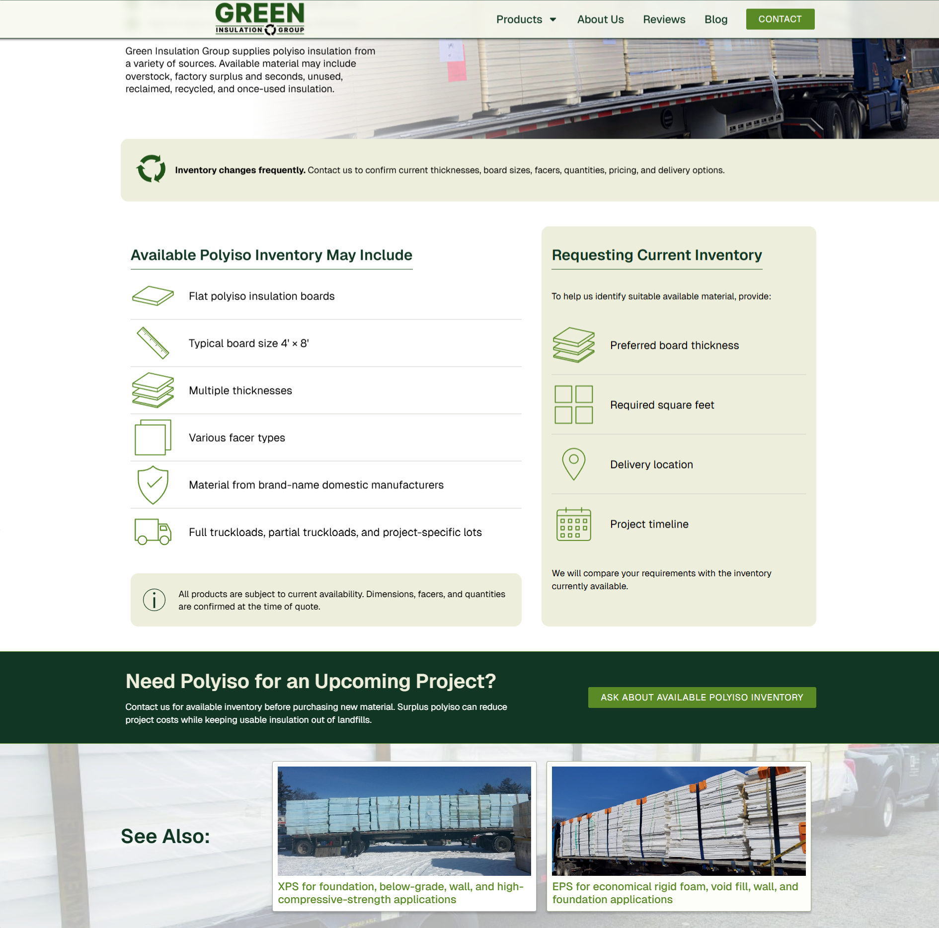
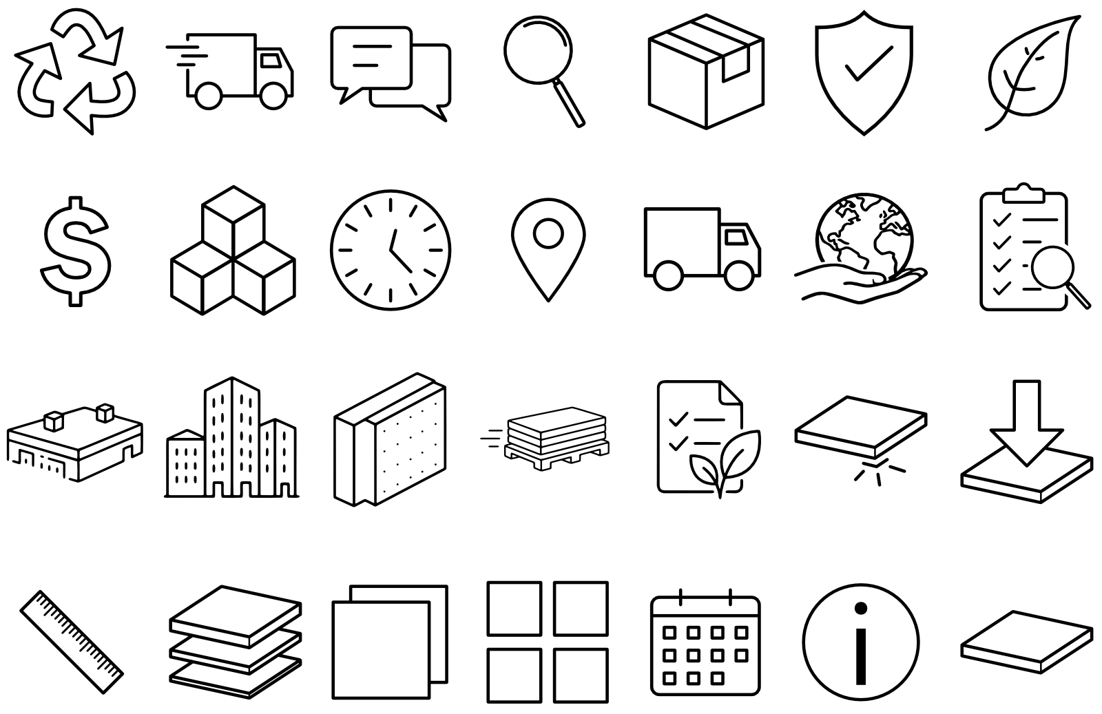
The visual redesign began with a new logo that preserves the company's environmental positioning while providing a cleaner and more flexible identity for digital use. I developed that into a broader visual system built around the company's green palette, strong typography, organic forms, and imagery that connects construction materials with their environmental impact. I also created a cohesive family of custom line icons to communicate everything from delivery, inventory, and sustainability to specific product characteristics and building applications. Consistent stroke weights, geometry, and perspective allow the icons to function as a recognizable visual language throughout the site while making technical information easier to scan and understand.
Motion became an unusually important part of the site's personality. The client responded enthusiastically to early animation concepts, which encouraged me to develop a richer motion language throughout the experience. Animated typography, transitions, brand-inspired graphic movement, and other interactive details give the desktop site energy without competing with the underlying content. On smaller screens, where extensive animation can become distracting and affect usability, I deliberately reduced much of that movement to create a calmer and more efficient mobile experience.
The result is a site that more clearly communicates what makes Green Insulation Group distinctive: reclaimed building materials are not simply an environmentally responsible alternative, but a practical product offering with significant economic benefits. The redesign brings that message forward while giving the company's existing technical and educational content a stronger framework in which to work.