Project Summary
The MBTA Retirement Fund administers retirement benefits for active and retired employees of the Massachusetts Bay Transportation Authority. Serving thousands of members, retirees, and beneficiaries, the organization provides access to pension information, financial reports, forms, benefit resources, and other essential services. For many visitors, the website is a primary source of information used to navigate important retirement decisions and access frequently needed documents.
My Role
I was responsible for reorganizing the site's information architecture, visual design, and WordPress development with a strong emphasis on usability and accessibility. The primary objective was to replace an aging website that members found difficult to navigate with a clearer, more intuitive experience that allowed both active employees and retirees to locate information quickly and confidently.


Design & Development Highlights
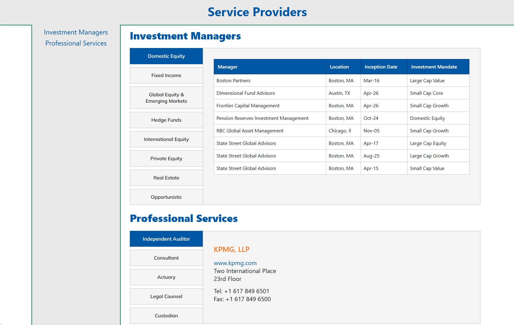
The most significant challenge of the project was not creating new content, but making existing information substantially easier to use. Rather than simply refreshing the site's appearance, I restructured the content hierarchy to better reflect how members naturally search for information. Navigation was simplified, related resources were grouped more logically, and key tasks were made easier to discover, resulting in a website that users have consistently found more intuitive than its predecessor.
Accessibility was a guiding principle throughout the project. Because many visitors rely on assistive technologies or have age-related vision changes, the site was designed with screen reader compatibility, strong color contrast, and clear visual hierarchy in mind. Careful attention was given to typography, spacing, and navigation to improve readability while helping ensure important retirement information remained accessible to the widest possible audience.
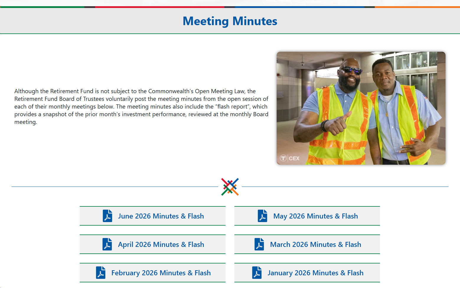
The visual design maintains the Retirement Fund's established brand identity through consistent use of its color palette and typography while presenting information in a cleaner, more modern format. Custom mega menus were introduced to organize a large collection of documents, forms, policies, and member resources without overwhelming visitors, allowing complex information to remain both comprehensive and approachable.
The resulting website demonstrates how thoughtful information architecture can transform the user experience. By focusing on clarity, accessibility, and intuitive navigation, the redesign has helped members spend less time searching for information and more time finding the answers they need.