Project Summary
Boston Town Crier offers guided walking tours of Boston's historic Freedom Trail, bringing the city's Revolutionary history to life through knowledgeable guides in authentic Colonial-era attire. Serving visitors from around the world, the company combines education and entertainment to create an engaging introduction to one of America's most historic cities.
My Role
My primary contribution was developing a new visual identity for the company, beginning with a redesigned logo that established a stronger and more recognizable brand presence. Building on that identity, I redesigned the company's rack card to improve readability, strengthen visual communication, and create a more effective marketing piece for display throughout Boston's tourism network. I also provided design oversight and refinements to the company's website to maintain consistency across print and digital materials.


Design & Development Highlights
The previous brand identity lacked clarity and consistency, making it difficult to establish a strong visual presence. I created a new logo that captured the character of the Colonial town crier while introducing a cleaner typographic system and a cohesive color palette. The resulting identity is both historically inspired and versatile enough to work across print, signage, and digital applications.
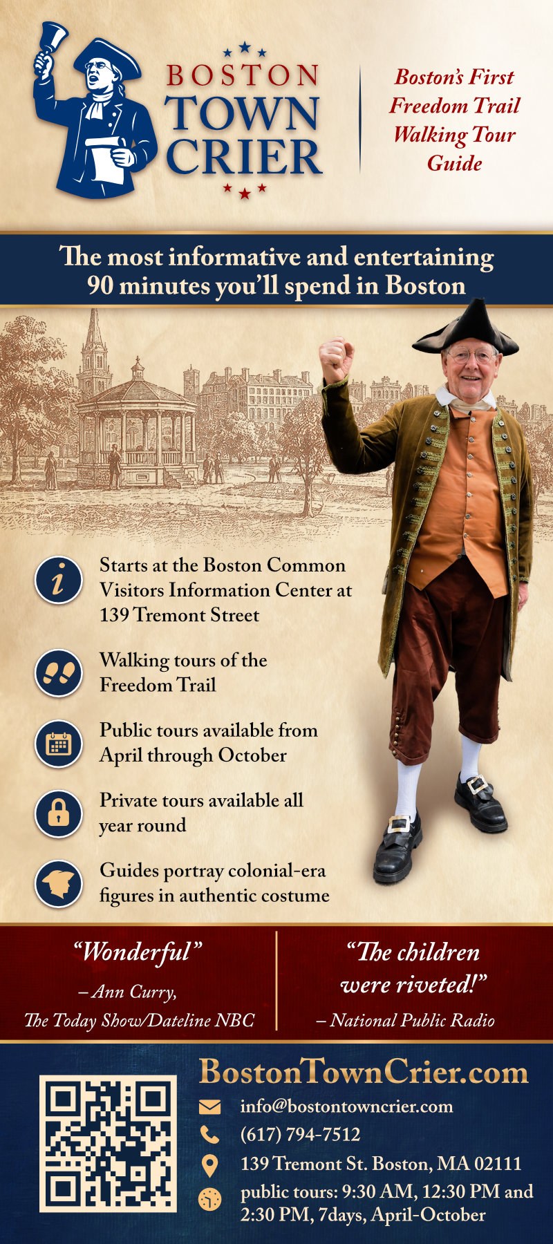
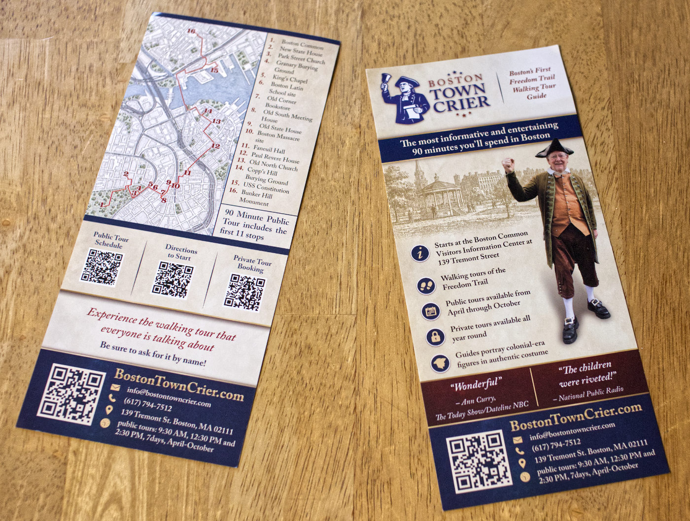
The client's existing rack card was outdated and difficult to scan, with dense information competing for attention. Working within the limited space of a standard rack card, I restructured the content to establish a clear information hierarchy that guides readers from the primary message to supporting details without overwhelming them.
Typography, spacing, and layout were carefully refined to improve readability while preserving the personality of the Boston Town Crier brand. The redesign also incorporates practical features, including a Freedom Trail route map, tour information, and QR codes, that help visitors quickly understand the experience and access additional information.
The finished piece balances historical character with modern clarity, creating a marketing handout that is both visually engaging and highly functional in the fast-paced environment of Boston's visitor centers.